

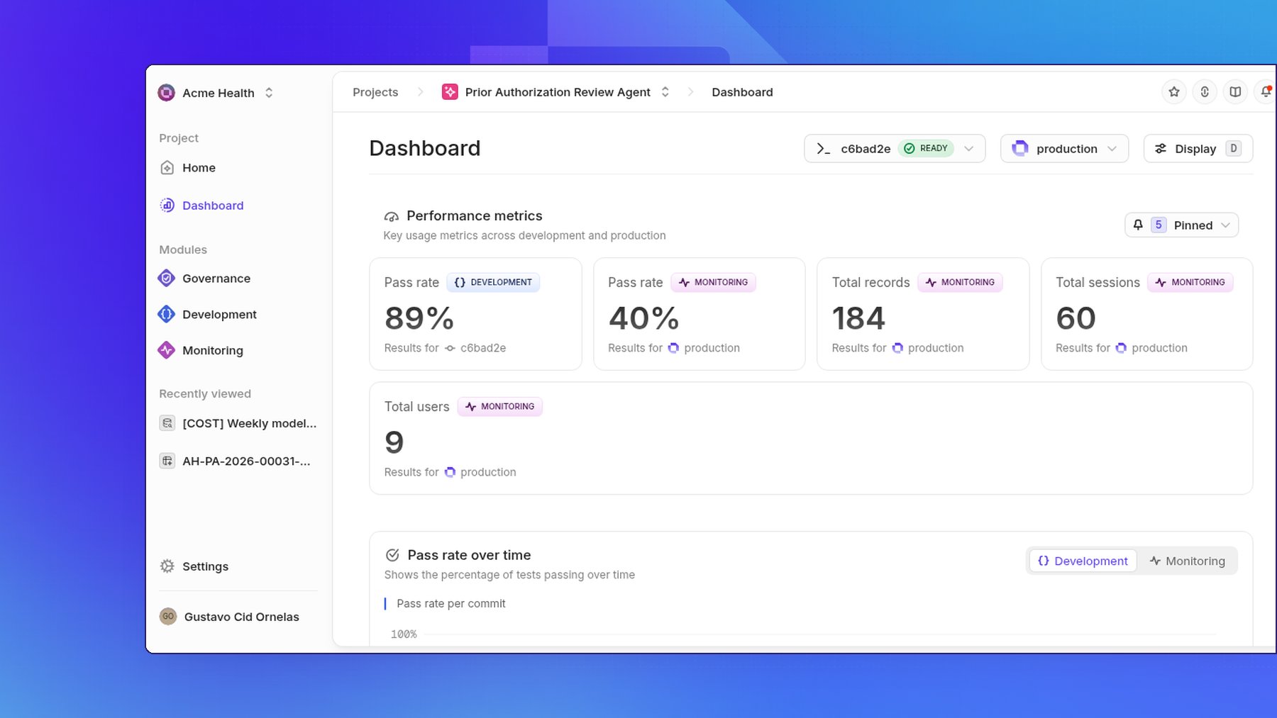
Prerequisite: you need a
project to follow
this guide.
Open the dashboard
- Log into your Openlayer account.
- Open the project you want to inspect.
- Click Dashboard.
Choose commit and data source
Two comboboxes at the top of the page set what the sections below report on:- Select a commit picks the commit — the platform also calls a commit a project version. Use Find commit… to search among them.
- Select a data source picks the data source. Use Find data source… to search among them.
Sections
The dashboard is made up of these sections. Where a section has a Development/Monitoring toggle.- Performance metrics — “Key usage metrics across development and production”
- Pass rate over time — the percentage of tests passing over time, with a Development / Monitoring toggle
- Column distributions — “Record counts broken down by category across development and production”
- Failing tests — the tests that fail most often, with columns Test name, Failures, Latest result, Threshold, and Created by, and a Development / Monitoring toggle
- Tests — “Performance of pinned tests over time across development and production”
- Recent activity — “Project updates and notifications”
- Usage and cost — token consumption and estimated cost, with a Monitoring / Development toggle
- LLM-as-a-judge costs — evaluator model spend from LLM-as-a-judge tests, kept separate from inference usage and cost
Pin metrics and distributions
Until you pin anything, the three sections show their empty states:- Performance metrics shows No metrics pinned and prompts you to Pin metrics.
- Column distributions shows No distributions pinned and prompts you to Pin distributions.
- Tests shows No tests pinned, Pin tests to view their results over time, and a Pin tests button.
Track usage and cost
Usage and cost reports how many tokens the project consumes and what they cost. The toggle in the section header picks Monitoring or Development, and the two modes are never combined, so production usage never mixes with offline experiments. Monitoring groups production traces by data source, with an Unassigned bucket for traces no data source claims. Development groups offline traces by commit, newest first, and compares every commit in the project. Data sources and commits you have removed still appear, labeled(deleted) or (archived), so past spend stays accounted for.
When the selected mode has usage data, the section shows three separate chart
cards:
- Token usage over time shows Daily totals for the selected mode. Modes are never combined. Use the Tokens / Cost toggle to change the value plotted.
- By data source in monitoring describes Tokens and estimated cost by data source. By commit in development describes Tokens and estimated cost by commit. Up to five groups appear by name, with longer tails folded into Other. Click a navigable bar to open that data source or commit on the data page. Unassigned is not clickable.
- Tokens by type describes Input, output, cached, and other tokens plus estimated cost. Its legend categories are Input, Output, Cached, and Other. The center shows total tokens, and the list includes Estimated cost.
- Token usage over time shows No time series yet and Daily token and cost totals appear here once traces are collected.
- By data source shows No token data and No data source has recorded token usage yet. By commit shows No token data and No commit has recorded token usage yet.
- Tokens by type shows No token categories and Input, output, and cached tokens appear here when usage details are available.
Track LLM-as-a-judge costs
LLM-as-a-judge costs tracks the evaluator model spend from your LLM-as-a-judge tests. It stays separate from Usage and cost, so judging your outputs never looks like a change in the cost of producing them. The section header carries the same Monitoring / Development toggle, and again the modes are never combined: monitoring reports on evaluator runs against production traces, development on evaluator runs against a commit. Two charts split the spend — By test bars and By model donut. Spend that Openlayer cannot attribute to a test lands in Unassigned, and when a single evaluator run covers several tests, its cost is split equally across them. Until an LLM-as-a-judge test runs, the section reads No judge costs tracked yet and offers Learn about LLM-as-a-judge.Customize display
Click Display (keyboard shortcutd) to open the Customize display
popover. Use it to choose and reorder sections: “Choose and reorder sections to
customize your dashboard”. The checkboxes show or hide each of the eight
sections, and the drag handles reorder them.